



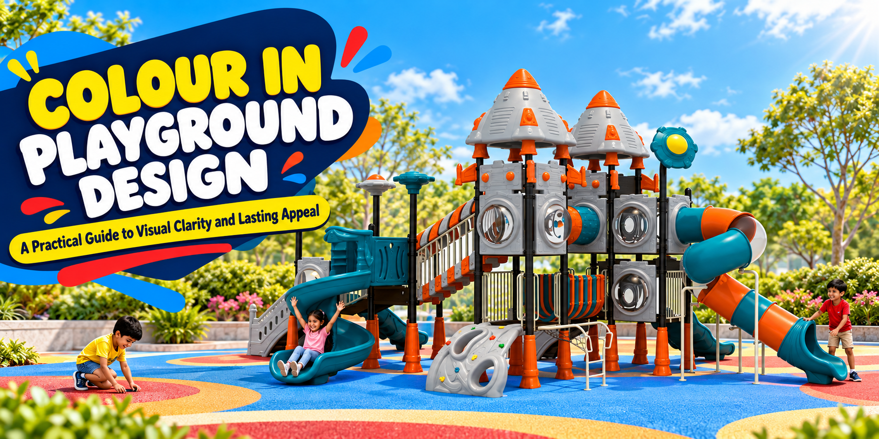
Playground Colour Design: Make Every Colour Earn Its Place
At first glance, one playground is a sea of red, yellow and blue. Another uses a quiet base palette with a few bright points. Which is better for children? The answer depends on what the colours help them see and do, how the space sits in its surroundings, and what the materials will look like after several summers.
Colour is an important part of playground equipment design, but it is easy to overstate its powers. No single shade guarantees confidence, calm or creativity. A useful palette can mark routes, make components easier to notice, support a story and give a school or residential landscape a coherent identity. It should be judged alongside age suitability, surface performance, accessibility and maintenance.
For architects, developers and schools, the right question is not “Which colour is most playful?” It is “What job does each visual choice perform?”
Begin with children at ground level
Start by walking the site at a child's eye height. What is visible from the entrance? Can the first activity be identified without a sign? Does a child notice where a slide ends or a path turns? Do carers have a clear view of the busy areas?
Use colour to establish a visual hierarchy. A main play structure may be the landmark; entry points and shared activity panels can have a consistent accent; seating and backgrounds can remain calmer. That gives attention a place to go. If every post, roof, floor pattern and sign competes equally, the layout may be harder to read despite being colourful.
A children's playground equipment manufacturer should show the selected colours on a site view as well as a product rendering. Adjacent walls, trees, paving and shade change how the palette appears. Ask for physical material samples before approving a finish from a screen.
The operator should join that review. They will know which areas collect dust, how often surfaces are cleaned and which components are likely to need replacement first. Visual design has an operating life, not just an opening-day photograph.
Make routes legible without relying on colour alone
A coloured path can help people find an entrance or connect activities, but it should not be the only cue. Shapes, position, signs, textures where appropriate and consistent layout can reinforce the meaning. This is especially relevant for children who distinguish colours differently and for anyone visiting in poor light.
The W3C's guidance on using colour in digital interfaces says that colour should not be the only way information is conveyed. That is a web accessibility rule, not a playground standard; applying the same principle to physical wayfinding is a design inference. If the “green route” leads to one area and the “red route” to another, add recognisable symbols or clear destinations rather than relying only on hue.
Check contrast between a feature and its immediate surroundings. A handhold may be easier to identify when it stands out from a panel, while a step edge should remain visible under realistic lighting. Contrast is one consideration among many; the surface must still have appropriate texture, shape and structural performance. The U.S. Access Board's play-area guide addresses physical access and routes, but its U.S. requirements are not Indian legal rules.
Match visual energy to the site's use
A school courtyard may need a clear, lively landmark while preserving open visual lines for staff. A housing society may want a palette that works beside planted gardens and residential architecture. A resort may seek a memorable structure that belongs to its overall setting. These are brief-specific decisions, not universal colour prescriptions.
Ask who uses the playground and when. Preschool groups, mixed-age neighbourhood users and resort guests may interact with the same form differently. There may be a case for stronger contrasts at younger children's entry points and more restrained background elements around a social area. Let play routes and visibility drive the decision rather than assuming that every school should use primary colours.
Colour can also carry a theme without saturating the site. A single distinctive roof, a recurring accent and a coordinated ground pattern may tell a story more effectively than printing graphics on every panel. Children will add their own meanings to the structure.
Do not turn colour psychology into a specification
It is tempting to say red creates energy, blue produces calm and green guarantees safety. Such claims are too broad for a technical buying guide. Responses vary with context, light, culture, individual perception and the whole environment. A blue panel beside a loud road will not make a playground quiet; a yellow slide will not by itself make a child more social.
Use observable design outcomes instead. Can a child find the next route? Is a boundary distinguishable? Does the palette fit the age group and setting? Can adults supervise? Are signs readable? If a client wants a particular emotional character, make it part of the design brief and evaluate the complete site with intended users.
UNICEF India's discussion of play describes the value of children's exploration and imagination. It does not prescribe a colour scheme. A visual design should give children useful opportunities to play, not promise a measured developmental effect from a pigment.
Consider heat and touch in Indian conditions
Colour interacts with sun, shade and material, but visual lightness alone is not a sufficient safety assessment. The U.S. CPSC playground burn fact sheet warns that playground surfaces can become hot enough to cause burns and that coated or plastic equipment is not automatically exempt. Check likely play hours, direct sun exposure and the actual touch surfaces children will use.
Ask suppliers for relevant material and finish information. Where practical, evaluate samples in local conditions and plan shade over the most-used activities and waiting areas. A dark coloured surface may raise concerns, yet even a light surface can be uncomfortable under intense sun. The complete material, coating, exposure and installation matter. Give carers a way to assess conditions before children use equipment after it has stood in the sun.
Arihant Play's FAQ discusses UV-stabilised plastics and measures intended to reduce fading. These statements should prompt a model-specific discussion rather than a promise that a particular shade will never fade or stay cool.
Specify colour as a maintainable finish
Outdoor playground equipment faces sunlight, rain, dust, cleaning and repeated contact. Record the selected substrate, colour code, finish system and replacement-part details in the product schedule. Ask how a scratched panel, chipped coating or faded part will be repaired. A single custom colour that cannot be matched later can become a long-term maintenance problem.
For a multi-activity play system, check what can genuinely be customised. Arihant Play states that many of its multi-activity systems can be customised to preferences and constraints. Confirm the available palette and finishes for the selected model, and ask whether changes affect delivery, warranty or documentation. Do not assume every product has identical options.
Material samples should be reviewed in sun and shade. A render's vivid cyan, for example, may look different on moulded plastic, powder-coated steel and a poured surface. If the design relies on those materials matching exactly, ask for samples or accept deliberate variation.
Let the playground and landscape share a composition
Natural planting provides a changing backdrop. A structure may be striking in winter light and partially hidden as trees grow. Draw the landscape at mature size and assess how it will frame sightlines, not just colours. The ground plane should connect equipment, routes and seating while meeting the required performance for fall areas.
Arihant Play offers rubber flooring in its product range, but colour is only one part of the surfacing specification. The system needs appropriate impact performance, accessible routes where required, sound edges, drainage and maintenance. A graphic pattern should not obscure where children land or introduce confusing changes in level.
Test a site view with the graphics temporarily removed. Does the playground still have clear paths and interesting play? Aesthetic design is strongest when it reinforces the structure rather than disguising a weak layout.
Approve the design in three views
Before ordering, request a scaled plan showing use zones and routes, a perspective from the child's approach, and physical finish samples. Review all three with the playground equipment supplier, architect and eventual operator. The plan catches clashes; the perspective tests first impressions; the samples reveal how materials actually look and feel.
Then ask a practical final question: if one element needs replacement in five years, can the visual system survive it? A coherent palette with recorded specifications is more resilient than an intricate one-off graphic on every surface.
Arihant Play's equipment range offers many forms and activities to consider. Share a site brief to discuss a colour approach that supports the children, setting and intended service life.
Frequently Asked Questions
1. What colours are best for playground equipment?
There is no universally best set of playground colours. A good palette supports the specific site's play routes, visibility, identity and maintenance. A bright accent can help distinguish an activity point, while a quieter background can prevent signs and handholds from competing for attention. The right balance changes with the surrounding architecture, planting and natural light.
Begin with a site plan rather than a catalogue swatch. Mark the entrance, key activities, likely supervision positions and routes. Decide which elements should stand out and which can recede. Check the palette on a perspective from a child's approach and request physical samples of the actual materials. A colour seen on a computer may look different on moulded plastic, coated steel and playground surfacing.
Avoid assigning fixed emotional effects to individual hues. A red component does not guarantee energetic play and a blue component does not guarantee calm. Evaluate what children can find and use. Ask the outdoor playground equipment manufacturer whether the selected colours are available for the exact model and how replacements will be matched. The best scheme is attractive on opening day and remains legible and maintainable over time.
Choose a palette for the complete scene, including seating and ground. Isolated swatches cannot show whether the finished space has a clear visual order.
2. Do bright colours improve children's learning or behaviour?
Colour may attract attention and support wayfinding, but a specific playground shade should not be sold as a guaranteed way to raise learning outcomes, concentration or sociability. Children's experiences depend on the whole environment, the activities available and how they use them. Strong colour can be valuable when it identifies a route or invites attention to a shared play feature; excessive decoration can make the design harder to read.
UNICEF India describes play as supporting several aspects of development. It does not identify one “best learning colour” for equipment. When a school wants a learning-rich playground, ask what children will actually do: choose a route, solve a play problem, move with friends or invent a story. Then use visuals to support those actions.
Test a proposed palette with teachers and children where practical. Ask them what they notice first and where they think a path leads, rather than asking only which colour they like. A brief observation after installation can show whether signs and activity points are easy to find. Keep claims modest: design can create opportunities, not guarantee a developmental result.
Be cautious of presentations that attach a developmental result to a single hue without specifying the study, age group and setting.
3. How can colour help children navigate a playground?
Colour can mark a main entrance, identify activity zones or connect points along a route. It works best when accompanied by position, a clear path, recognisable forms and signs or symbols where useful. A child should not need to distinguish two similar hues to know where to go.
The W3C's digital accessibility guidance advises against relying on colour as the only information cue on a website. That is not a playground regulation, but the underlying idea is useful for physical wayfinding. A star-shaped sign and a blue accent, for instance, communicate more robustly than blue paint alone.
Check whether an accent contrasts with the actual surroundings under shade and direct sunlight. Then walk the route at a child's height. Can a newcomer find the entrance and recognise an exit without crossing fast play? Colour should reinforce a coherent site layout, not compensate for confusing paths. Ask the supplier for a plan and site-level visual, because a product rendering on a blank background cannot answer these questions.
Where words appear on signs, check that they remain legible from the likely approach. Symbols can help, but their meaning should also be tested.
4. Should a playground match a school's or resort's brand colours?
It can, if those colours still work for children and for the physical site. Branding is one goal among many: legible routes, age-appropriate play, accessible participation, surface performance and long-term repair are more consequential. A school crest may be clearest on an entrance sign, with selected brand colours repeated on a few components rather than every post.
For a resort, consider the wider architecture and landscape. A playful accent can create a memorable destination without making the equipment look unrelated to its setting. For a school, ask whether the palette helps staff and children identify distinct activity points and whether the colours remain readable in sun and shade.
Arihant Play's FAQ says many multi-activity systems can be customised; confirm the options for the exact model. Record approved colour codes, sample references and graphic files so parts can be replaced later. Do not alter structural components merely to achieve an aesthetic match without manufacturer review. A brand-consistent playground should still be a strong playground when the logo is out of view.
Ask for a version without logos to see whether the play structure retains its appeal. The experience for children should carry the design.
5. Can dark playground equipment become too hot in the sun?
Heat exposure needs review, but colour alone cannot predict whether a component is safe to touch. Material, coating, direct sunlight, shade, air temperature and time of day all matter. The U.S. CPSC burn fact sheet warns that playground equipment can cause thermal burns; plastic or coated surfaces should not automatically be assumed safe.
Study the proposed location at the hours families will visit. Identify surfaces children grasp, sit on and slide across, then ask the supplier about the material and finish. Provide effective shade where possible and establish how staff or carers will check conditions during hot periods. A dark accent on a vertical decorative panel poses a different use question from a dark seat or sliding surface in full sun.
Do not promise a fixed temperature difference from choosing a lighter palette unless it has been measured for the relevant materials and conditions. Use the visual design together with shade planning and operational judgment. A photogenic colour is not worth making an activity uncomfortable at peak use times.
A maintenance protocol for hot days should be discussed with the operator. Material selection and shade cannot remove the need for on-site judgment.
6. Which playground colours resist fading best outdoors?
No simple ranking applies to every pigment and product. Fading depends on the pigment, resin or coating system, UV exposure, climate, cleaning and maintenance. Two red panels from different suppliers may age differently; two surfaces of the same shade may differ if one is moulded plastic and the other coated metal. Ask for model- and material-specific information rather than a blanket claim that a colour “never fades.”
Arihant Play's FAQ describes UV-stabilised plastics and measures intended to reduce colour fading. Buyers can ask how the selected product is specified, what warranty covers, and how a replacement part will be matched after several years. Record colour codes and finish samples in the handover documents.
Assess exposure on the actual site. One side of a structure may receive much more afternoon sun than another; shade from new trees will change over time. Consistent maintenance and appropriate cleaning matter too. A colour scheme that tolerates modest weathering and allows component replacement can remain attractive longer than one dependent on a perfect match across many materials.
Request a small spare-parts plan for highly visible elements. Matching a key panel later is easier when the approved finish is documented now.
7. How do I make a colourful playground accessible?
Start with physical access: a suitable route, usable surfaces and meaningful play at ground level. Colours cannot replace these requirements. Then consider visual legibility. Use appropriate contrast where children need to recognise steps, handholds, entrances or signs, and reinforce important distinctions through form, position or symbols rather than hue alone.
The U.S. Access Board's play-area guide describes accessible routes and ground-level components. Its legal provisions apply in the U.S.; Indian project teams must confirm local requirements. The W3C colour principle concerns digital interfaces, but offers an analogy for avoiding colour-only messages in site wayfinding.
Seek feedback from users with different visual and sensory needs. A busy surface graphic may be exciting for some and confusing for others. Check signs under realistic light and after weathering. A well-composed palette makes the space easier to understand while allowing children with different abilities to join the same play experience.
Contrast should be reviewed on the installed site, not merely in a render. Light, shadows and adjacent plants can change what stands out.
8. How should floor colours and graphics be used in a playground?
The ground can guide movement, support games and connect equipment to landscape. It can also become cluttered or misleading if arrows point into equipment exits or decorative bands conceal changes in level. Draw every marking on the actual surfacing and circulation plan, then review where children will run, stop and land.
Protective surfacing has a technical job first. Specify its performance for the equipment's fall heights and use zones, its installation base, edges, drainage and maintenance. Arihant Play lists rubber flooring, but a colour pattern does not tell a buyer whether the complete system is suitable. Ask for the product data and site-specific layout.
Use visual contrast thoughtfully so essential features remain clear. A painted game can be a good use of open space if it does not create an obstruction or conflict with an accessible route. Consider cleaning and repair: can a worn marking be renewed without compromising the surface? The best floor graphic adds play or clarity and remains understandable as the material ages.
Keep graphic rules simple enough for maintenance staff to reproduce. Complicated markings can lose their meaning after partial repairs.
9. Are nature-toned playgrounds better than brightly coloured ones?
Neither is inherently better. Nature tones may sit comfortably among trees and buildings; vivid accents can make an entrance or play feature easier to find. The design should reflect the site's play goals, lighting and maintenance rather than a general belief that one style is more educational or sustainable.
A restrained palette may make a planted setting feel coherent, but it still needs enough visual distinction where routes, handholds or activity points should be noticed. A bright structure can work beautifully against greenery if its use zones, shade and supervision are well planned. Avoid assuming a brown panel is a natural material or that a green product has a lower environmental impact. Ask for actual material and sourcing evidence for such claims.
Look at samples in the site, under likely sun and shade. Consider what will happen when plants mature and how components will be replaced. Compare two or three coordinated palettes against the same plan rather than making the decision from separate catalogue photos. Children can play imaginatively in either visual style when the underlying environment gives them interesting choices.
If a client is uncertain, compare mock-ups of both options in the same site photograph. The surroundings often make the choice clearer.
10. What should I ask a playground manufacturer before approving colours?
Ask which colours and finish systems are available on the selected model, and which changes count as customization. Request physical samples for the main materials, a schedule with colour codes and a site rendering showing the palette against actual buildings and landscape. Clarify whether artwork, custom panels or special finishes affect price, lead time, warranty or replacement parts.
Check material-specific durability claims and the proposed maintenance method. Ask how a damaged or faded component will be replaced, whether matching parts are expected to remain available, and what documents the operator receives at handover. Review high-contact surfaces for comfort in the local sun rather than approving from a digital visual alone. The CPSC burn guidance is a useful reminder to consider heat exposure.
Finally, confirm that visual changes do not alter equipment performance, safety areas, age guidance or accessibility. Arihant Play discusses customization and finishes in its FAQ, but current model-specific approval is needed. The purchase order should refer to the same drawing and finish schedule that the client signed off.
Name who signs off final samples and substitutions. A change in material or shade during production should not silently alter the approved design.
Research references and publication checks
- Arihant Play FAQ: materials, customization and colour
- Arihant Play product range
- U.S. CPSC: Playground Burn Fact Sheet
- U.S. Access Board: Play Areas Guide
- W3C: Understanding Use of Color — cited as an analogy for wayfinding, not a playground standard
- UNICEF India: The science of play